Who visits your website and when?

Bed & Breakfast / Short Term Rental Host Forum

Help Support Bed & Breakfast / Short Term Rental Host Forum:

This site may earn a commission from merchant affiliate links, including eBay, Amazon, and others.

dumitru

Well-known member
Joined
Oct 7, 2013
Messages
361
Reaction score
60
Location
Dortmund, Germany
Hi guys,
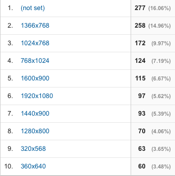
When was the last time you checked the "Screen Resolution" stat from Google Analytics for your website?
Go into G Analytics > Reporting > Audience > Technology > Browser & OS and select the "Screen Resolution" primary dimension.
I was thinking now about redesigning one of my older websites and was left a little speechless (screenshot attached).
As a developer for the past 10 years I've been used to seeing larger monitor sizes getting a bigger share of visitors with each passing year.
And now BOOM!
#1 with 27.6% is 1366 x 768 - many laptops use this resolution
#2 with 9.34% is 1920x1080 - generally the widest "normal" monitors you can have (I have 2 of these on my working desk)
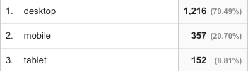
#3 with 7.21% is 360x640 - mobile users (not tablets)
I have to mention that these stats are for one of my websites that has been designed a long time ago and is not even responsive, yet mobile users are on the 3rd spot.
Anyone else willing to share some stats?
 
Do not remember how to do screen shot (remember, I am numbnutz - should use that as my name) but this was from this morning.
top 10 screen sizes visits %

1920x1080 22
bar_middle13.7
bar_middle bar_top

360x640 16
bar_middle9.9
bar_middle bar_top

1280x1024 13
bar_middle8.1
bar_middle bar_top

1366x768 11
bar_middle6.8
bar_middle bar_top

320x568 11
bar_middle6.8
bar_middle bar_top

1600x900 11
bar_middle6.8
bar_middle bar_top

1024x768 10
bar_middle6.2
bar_middle bar_top

1280x800 8
bar_middle5.0
bar_middle bar_top

375x667 8
bar_middle5.0
bar_middle bar_top

768x1024 6
bar_middle3.7
bar_middle bar_top
21 screen sizes not shown, each used in 6 visits or less
 
A simpler and more comprehensive way to do this is to click: Audience, Mobile, Overview and you get info quantified by Desktop, Tablet, Mobile. (to see more exact breakdown click Devices)
My stats for the past six months are: Desktop 62.5%; Tablet 19.1%; Mobile 18.4%, which is a scary re optimization since there is now 37.5% Non-Desktop Action! Yikes!
 
A simpler and more comprehensive way to do this is to click: Audience, Mobile, Overview and you get info quantified by Desktop, Tablet, Mobile. (to see more exact breakdown click Devices)
My stats for the past six months are: Desktop 62.5%; Tablet 19.1%; Mobile 18.4%, which is a scary re optimization since there is now 37.5% Non-Desktop Action! Yikes!.
Your site theme is totally responsive...you don't have to worry about it. Unless you changed it.
.
I'm not worried about it being responsive, more what it looks like when it reformats to tablet or mobile formats. Thus, yesterday I got rid of all the Striking Sidebar Widgets and went to Full Page style on everything but the Home Page. Much cleaner look now on tab and smaller viewports. Methinks...
.
It looks good on my tablet. But it has to be responsive to format properly, so a responsive theme is necessary.
On a tablet all the sidebars go to the bottom of the page so you can leave them.
.
I have most of my necessary redundant stuff in the footer. What I had in the sidebar was the Check Availability (which is now moved within the page) and various small pix depending upon the page. Sorta like the sidebar still on the home page. On a mobile phone or smaller vertical tablet, it became just a long single column to scroll through before getting to the also single column footer (like the current home page view). Yours is more broken up with text, etc.
Will likely just create a Gallery page of my extraneous photos... someday, which hey, with all the emptiness is likely soon.
 
A simpler and more comprehensive way to do this is to click: Audience, Mobile, Overview and you get info quantified by Desktop, Tablet, Mobile. (to see more exact breakdown click Devices)
My stats for the past six months are: Desktop 62.5%; Tablet 19.1%; Mobile 18.4%, which is a scary re optimization since there is now 37.5% Non-Desktop Action! Yikes!.
Your site theme is totally responsive...you don't have to worry about it. Unless you changed it.
.
I'm not worried about it being responsive, more what it looks like when it reformats to tablet or mobile formats. Thus, yesterday I got rid of all the Striking Sidebar Widgets and went to Full Page style on everything but the Home Page. Much cleaner look now on tab and smaller viewports. Methinks...
.
You really didn't need to do that..It all reformats itself when it switches modes.
.
EN, check out my new Availability page that seamlessly incorporates Res Key!
 
Here's our data, non-responsive site designed for 760 pixel width...
Screen%20shot%202016-01-09%20at%208.19.08%20PM.png

or
Screen%20shot%202016-01-09%20at%208.21.23%20PM.png
 
A simpler and more comprehensive way to do this is to click: Audience, Mobile, Overview and you get info quantified by Desktop, Tablet, Mobile. (to see more exact breakdown click Devices)
My stats for the past six months are: Desktop 62.5%; Tablet 19.1%; Mobile 18.4%, which is a scary re optimization since there is now 37.5% Non-Desktop Action! Yikes!.
I know that, I was mostly interested in the screen-sizes, and not just the "Desktop / Mobile" % stat. Because even on Desktop you can have 50% of 1280x1024, so that would be weird too.
 
A simpler and more comprehensive way to do this is to click: Audience, Mobile, Overview and you get info quantified by Desktop, Tablet, Mobile. (to see more exact breakdown click Devices)
My stats for the past six months are: Desktop 62.5%; Tablet 19.1%; Mobile 18.4%, which is a scary re optimization since there is now 37.5% Non-Desktop Action! Yikes!.
Your site theme is totally responsive...you don't have to worry about it. Unless you changed it.
.
I'm not worried about it being responsive, more what it looks like when it reformats to tablet or mobile formats. Thus, yesterday I got rid of all the Striking Sidebar Widgets and went to Full Page style on everything but the Home Page. Much cleaner look now on tab and smaller viewports. Methinks...
.
Momma Smurf said:
I'm not worried about it being responsive, more what it looks like when it reformats to tablet or mobile formats. Thus, yesterday I got rid of all the Striking Sidebar Widgets and went to Full Page style on everything but the Home Page. Much cleaner look now on tab and smaller viewports. Methinks...
Your site looks great, has been a while since I stopped in to check it out. Beuatiful new photos, really inviting!
I use full page style on everything but social media page for that reason you mention. In fat need to do that wth the blog itself.
I did something in ealy December and will mention it here, and I hope it helps. I went to our state tourism conference (not B&B related) and from some reliable sources i gleaned:
Big thumbs-design your sites for big thumbs (like my husband vs my daughter) imagine his thick man-hands using a small cell phone to book a room.
Scrolling-design it (or redesign it) for scrolling. That is how they roll today. There is no longer a standard page length, people scroll, fast, and yes using those big thumbs mentioned above.
So the take away is: scrollable with BIG BUTTONS for quick action to check avaiability, make reservations, see rooms.
Go to our website and you will see what i put on the bottom of most key pages (other than the homepage).
.
That is why I bite the financial bullet every year to go to the Tourism Conference. I not only pick up a nugget or two and network with the people I need to network with, but Tourism Division pays for studies and they GIVE us the results.
This year they told us how long between the first search in our State and the actual booking among the things that were tracked. The new Commissioner is into the high tech stuff.
 
A simpler and more comprehensive way to do this is to click: Audience, Mobile, Overview and you get info quantified by Desktop, Tablet, Mobile. (to see more exact breakdown click Devices)
My stats for the past six months are: Desktop 62.5%; Tablet 19.1%; Mobile 18.4%, which is a scary re optimization since there is now 37.5% Non-Desktop Action! Yikes!.
Your site theme is totally responsive...you don't have to worry about it. Unless you changed it.
.
I'm not worried about it being responsive, more what it looks like when it reformats to tablet or mobile formats. Thus, yesterday I got rid of all the Striking Sidebar Widgets and went to Full Page style on everything but the Home Page. Much cleaner look now on tab and smaller viewports. Methinks...
.
Momma Smurf said:
I'm not worried about it being responsive, more what it looks like when it reformats to tablet or mobile formats. Thus, yesterday I got rid of all the Striking Sidebar Widgets and went to Full Page style on everything but the Home Page. Much cleaner look now on tab and smaller viewports. Methinks...
Your site looks great, has been a while since I stopped in to check it out. Beuatiful new photos, really inviting!
I use full page style on everything but social media page for that reason you mention. In fat need to do that wth the blog itself.
I did something in ealy December and will mention it here, and I hope it helps. I went to our state tourism conference (not B&B related) and from some reliable sources i gleaned:
Big thumbs-design your sites for big thumbs (like my husband vs my daughter) imagine his thick man-hands using a small cell phone to book a room.
Scrolling-design it (or redesign it) for scrolling. That is how they roll today. There is no longer a standard page length, people scroll, fast, and yes using those big thumbs mentioned above.
So the take away is: scrollable with BIG BUTTONS for quick action to check avaiability, make reservations, see rooms.
Go to our website and you will see what i put on the bottom of most key pages (other than the homepage).
.
"Fat fingers" is the term they used. I called it big thumbs as tha is what people use on cell phone.
.
See - I am not the only one with "fat fingers" syndrome.
 
A simpler and more comprehensive way to do this is to click: Audience, Mobile, Overview and you get info quantified by Desktop, Tablet, Mobile. (to see more exact breakdown click Devices)
My stats for the past six months are: Desktop 62.5%; Tablet 19.1%; Mobile 18.4%, which is a scary re optimization since there is now 37.5% Non-Desktop Action! Yikes!.
Your site theme is totally responsive...you don't have to worry about it. Unless you changed it.
.
I'm not worried about it being responsive, more what it looks like when it reformats to tablet or mobile formats. Thus, yesterday I got rid of all the Striking Sidebar Widgets and went to Full Page style on everything but the Home Page. Much cleaner look now on tab and smaller viewports. Methinks...
.
Momma Smurf said:
I'm not worried about it being responsive, more what it looks like when it reformats to tablet or mobile formats. Thus, yesterday I got rid of all the Striking Sidebar Widgets and went to Full Page style on everything but the Home Page. Much cleaner look now on tab and smaller viewports. Methinks...
Your site looks great, has been a while since I stopped in to check it out. Beuatiful new photos, really inviting!
I use full page style on everything but social media page for that reason you mention. In fat need to do that wth the blog itself.
I did something in ealy December and will mention it here, and I hope it helps. I went to our state tourism conference (not B&B related) and from some reliable sources i gleaned:
Big thumbs-design your sites for big thumbs (like my husband vs my daughter) imagine his thick man-hands using a small cell phone to book a room.
Scrolling-design it (or redesign it) for scrolling. That is how they roll today. There is no longer a standard page length, people scroll, fast, and yes using those big thumbs mentioned above.
So the take away is: scrollable with BIG BUTTONS for quick action to check avaiability, make reservations, see rooms.
Go to our website and you will see what i put on the bottom of most key pages (other than the homepage).
.
Thanks JB for the visit and compliments! Yes, have done much tweaking since I first did the "new" website about a year ago.
I do see the BIG buttons on your site, which is a valid point and kinda funny since just yesterday I trimmed the size of my Check Availability button because to my design eye it seemed off scale. Will have fat fingers Poppa test it.
Anyway, is there something going on with the responsiveness of your site? When I looked at it on my mobile or tablet, say, the Rooms page, all of your room photos are extremely squished width-wise. Actually, it seems all your photos everywhere are not responding as they should, is it something in your formatting? The text parts are fine.
Since I do all my editing on a desktop, I will often tweak and not remember to retest on mobile or tablets. An easy way is to demo on desktop is to progressively narrow the width of your screen by dragging the side inward until you reach responsive mode. I am seeing the distortion this way also. Again, it's only the pix not the text.
.
I got a notice that an update was run by my theme and I noticed the photos were that way. Should not be. Thanks I will try to work it out.
 
While looking for these stats I found that we were mentioned on the website PopSugar. Cool. A fair amount of traffic the day the article posted. Kind of too bad they used someone else's photo instead of ours, but that's life.
 
A simpler and more comprehensive way to do this is to click: Audience, Mobile, Overview and you get info quantified by Desktop, Tablet, Mobile. (to see more exact breakdown click Devices)
My stats for the past six months are: Desktop 62.5%; Tablet 19.1%; Mobile 18.4%, which is a scary re optimization since there is now 37.5% Non-Desktop Action! Yikes!.
Your site theme is totally responsive...you don't have to worry about it. Unless you changed it.
.
I'm not worried about it being responsive, more what it looks like when it reformats to tablet or mobile formats. Thus, yesterday I got rid of all the Striking Sidebar Widgets and went to Full Page style on everything but the Home Page. Much cleaner look now on tab and smaller viewports. Methinks...
.
Momma Smurf said:
I'm not worried about it being responsive, more what it looks like when it reformats to tablet or mobile formats. Thus, yesterday I got rid of all the Striking Sidebar Widgets and went to Full Page style on everything but the Home Page. Much cleaner look now on tab and smaller viewports. Methinks...
Your site looks great, has been a while since I stopped in to check it out. Beuatiful new photos, really inviting!
I use full page style on everything but social media page for that reason you mention. In fat need to do that wth the blog itself.
I did something in ealy December and will mention it here, and I hope it helps. I went to our state tourism conference (not B&B related) and from some reliable sources i gleaned:
Big thumbs-design your sites for big thumbs (like my husband vs my daughter) imagine his thick man-hands using a small cell phone to book a room.
Scrolling-design it (or redesign it) for scrolling. That is how they roll today. There is no longer a standard page length, people scroll, fast, and yes using those big thumbs mentioned above.
So the take away is: scrollable with BIG BUTTONS for quick action to check avaiability, make reservations, see rooms.
Go to our website and you will see what i put on the bottom of most key pages (other than the homepage).
.
Thanks JB for the visit and compliments! Yes, have done much tweaking since I first did the "new" website about a year ago.
I do see the BIG buttons on your site, which is a valid point and kinda funny since just yesterday I trimmed the size of my Check Availability button because to my design eye it seemed off scale. Will have fat fingers Poppa test it.
Anyway, is there something going on with the responsiveness of your site? When I looked at it on my mobile or tablet, say, the Rooms page, all of your room photos are extremely squished width-wise. Actually, it seems all your photos everywhere are not responding as they should, is it something in your formatting? The text parts are fine.
Since I do all my editing on a desktop, I will often tweak and not remember to retest on mobile or tablets. An easy way is to demo on desktop is to progressively narrow the width of your screen by dragging the side inward until you reach responsive mode. I am seeing the distortion this way also. Again, it's only the pix not the text.
.
I got a notice that an update was run by my theme and I noticed the photos were that way. Should not be. Thanks I will try to work it out.
.
Hmmm I updated numerous sites with the Colorway theme. It didn't affect their images on the pages. But it did change the sizing on the slider on the home page. I had to redo them and make them larger. Theme is now responsive so something changed...better contact their support desk. Wish I knew what else to tell you.
confused_smile.gif

 
Back
Top