Generic
Well-known member
- Joined
- Feb 24, 2011
- Messages
- 7,728
- Reaction score
- 281
Thanks. I just replaced the slider because the old one was well... old. I looked at the themes out there. There is one thing in Avada's hotel theme that I really like...Yes loading now. I would say get rid of the slider all together and go with one big hero image. People do not wait around to look at sliders they want to go in and get the information quickly. Alot of developers I chat with say sliders are OUT. If a client of mine wants one now..I will only do 2 images any more I people will just leave it. Here's an article about it: https://yoast.com/opinion-on-sliders/Well, the old host is GONE as we speak. Everything is moved over and the website is showing up just fine. Trying to check that everything works. One task now on my plate... redoing that slider.
I actually didn't do the original, it was done by the guy I hired to set up the website under the Karma theme. And it's very old. Not that I need to change much, but it's under a very old type of slider and maybe it's just time to redo a new one with a new plugin that's a little more modern..
.
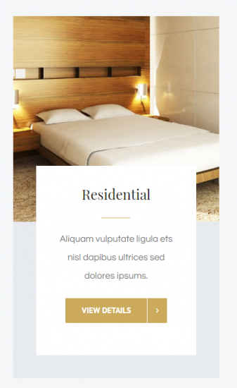
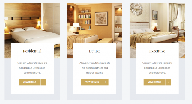
Instead of a hero image, I was thinking maybe putting the cityscape as the background image and then going with my room gallery below it. Unless I can figure out how they did that room gallery above... because if I can do that... I want that! Do I really have to buy that theme to do it? Because it's so tempting.