Hey Empty Nest, since you helped me out on my site I wanted to lend the same courtesy for your client's site!
")
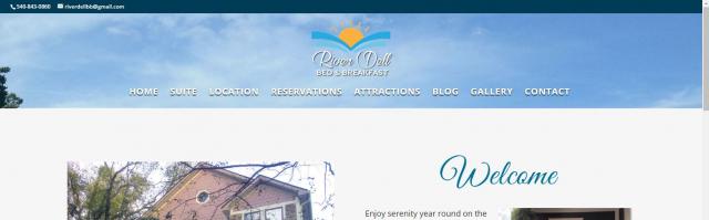
1) On the homepage, your top banner image seems to be cut off extremely short? It looks like there should be a beautiful large picture of the river there.
2) Is the house actually riverfront? Where is this beautiful river that is referenced everywhere on your site in relation to the house? As a prospective guest I would have a hard time knowing if the river is in the backyard, across the road, 10 minute walk away, across town, etc? Maybe take a picture showing how close the house is to the river or a better explanation since that seems to be the main selling point of this property but I had a hard time understanding exactly what to expect.
3) On the Suite page you have an amazing photo of the room in the top header. However when I scroll down to the Suite photo gallery there's not really an appealing picture of the "bedroom", the bed is cut off in all the pictures. I would put the same photo that you have in the header in the photo gallery because as a guest I would scroll right past the header so I can get to the content of the page and then once I get all the way to the bottom of the page to the suite photo gallery I would be expecting as good of a picture as you have in the header. Wouldn't hurt to also link to the Gallery page so they can see a photo gallery of the rest of the inn.
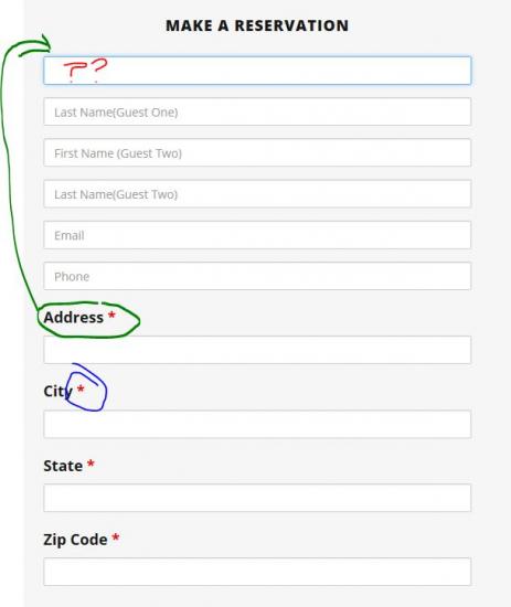
4) On the Reservations page, the form is laid out inconsistently which doesn't provide the best user experience and can be confusing. For the address, city, state, zip code, etc fields you have the labels of what to input directly above the field which is easy to use. However for some reason the name, email address, and phone number fields do not have the same label of what to input. Instead when I click on a field the label disappears so I became confused as to what I was supposed to input.
Also most of the fields have a red asterisk next to them which everyone knows means is required. However the name, email address, and phone number fields do not have a red asterisk by them so a guest may assume they are not required.
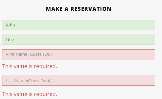
5) You also have a spot where I can select that I have 3 guests but I can only input 2 guest names, does the third guest's name not matter?
6) What if I am staying at the B&B with just myself (no guests) for business or just a solo traveler? You have made the Guest 2's name required to be entered, when guests might not have a second name to enter.
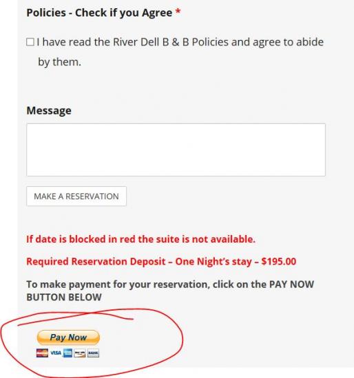
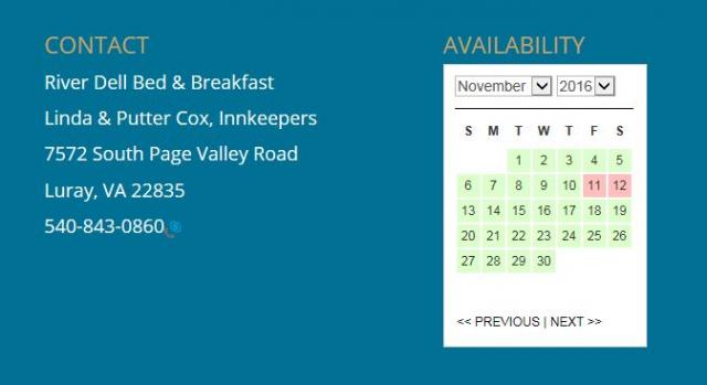
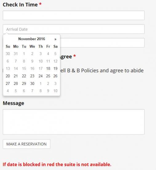
7) Another issue I can foresee with the reservation form is that you have a note added "If date is blocked in red the suite is not available." However when I choose my arrival date and departure date in the form there are no dates in red or green. I know you were referring to the other calendar at the top of the page but a guest may not realize that and instead think the date they selected is available only to be let down when they are informed it actually wasn't available.
8 ) Yet another issue you may run in to with the reservation form is once guests are done inputting all of their information, the button that stands out most is the bright yellow paypal Pay Now button. If I was a guest that is the button I would click on, I would probably accidentally skip right over the very small and white "Make a Reservation" button and click on the bright visible Pay Now button instead. When a guest clicks on the Pay Now button, none of the information they inputted on the reservation form is saved, it's all lost because they were supposed to click on the make a reservation button.
What I would suggest is remove the Pay Now button from this reservation page...and instead create a form received thank you / confirmation page that they would see after submitting the reservation form. This thank you page would then have the Pay Now button and directions to pay. Guests like multiple steps with clear and easy to follow directions, by combining it all into one page it's a little confusing.
9) In the footer of every page you have the availability calendar but no call to action below it. I would suggest adding a Make a Reservation button below the calendar, because if a guest is looking through that calendar they probably want to make a reservation but there's no easy or clear way for them to do it in that area. Since it's right next to the contact information, I might be inclined to think that the Inn doesn't offer online reservations and instead I have to call.
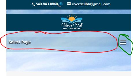
10) On the mobile site you have a dark background with the text "Select Page". When I click on "Select Page" or anywhere else in the shaded menu background area it acts like it's going to do something but the menu doesn't actually open. The menu only opens when I click on the three little hamburger line icons. I'm guessing this will confuse quite a few guests.
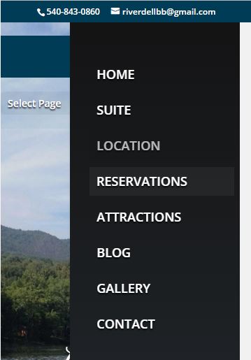
11) Once I opened the mobile menu I realized there was no way to close the menu. On most mobile websites there is either a close button or you can click somewhere else on the page and the menu will close. Instead I was stuck in the menu until I chose a menu item. There's a reason every other mobile site offers the ability to exit the menu.
12) Do the Innkeepers actually plan on posting regular content to the blog? I've found that blogs often get forgotten about and then when guests visit the website it looks like the site hasn't been updated for 4 years and leaves guests wondering if the B&B is still in business. If they don't plan on updating a few times a year, I would suggest removing this from the menu.
13) If you plan on keeping the blog....there is no header image, only a very light blue background which makes the white navigation menu links very hard to read.
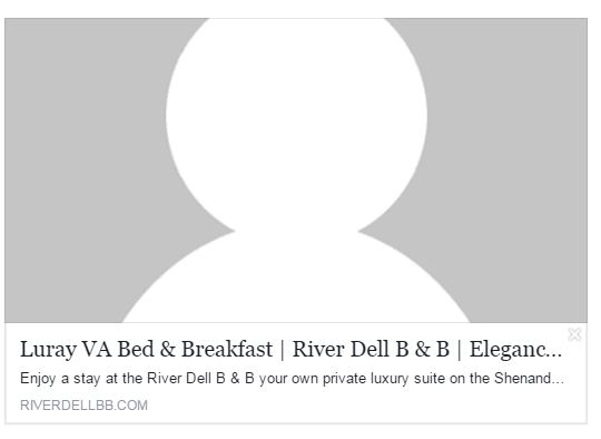
14) When I share the website's homepage on Facebook, Twitter, etc (which you can only hope guests will do) the preview box is showing a big user icon instead of a nice picture of the bed and breakfast. This is a simple fix by using the Yoast SEO plugin and going to the social media tab. It's a quick fix that will generate much more traffic when your links are shared on Facebook, after all which one below would you rather click on?
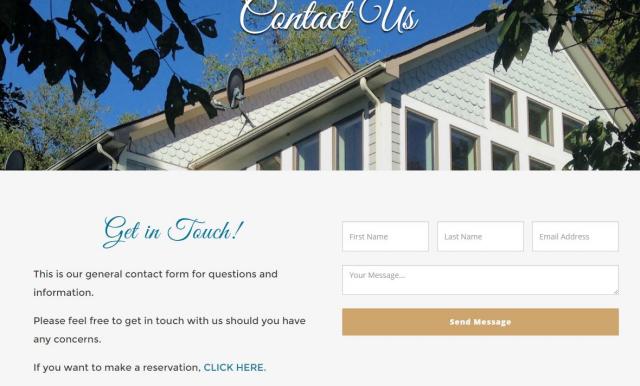
15) On the contact page the only thing that is featured is a big contact form? I know you have your phone number and address in the footer but I would make it as easy as possible for guests to contact you by clearly giving them as many options as possible. When guests go to a contact us page they expect to see your address, phone number, map, and a contact form. Users tend to glance right over the footer of sites so I would add the contact info more conspicuously to the body of the contact us page.
17) It looks like the site is creating a blank attachment for every single image and they are listed in google. Take a look at this page as an example:
https://riverdellbb.com/shopping/
You of course don't want people landing on this page because it has no info and will have a high bounce rate but could eventually rank very high in Google's organic search result. Your site has dozens of pages just like this - one for every image.
Here's a how-to on Wordpress Beginner.com on how to keep this from happening by using the Yoast SEO plugin:
http://www.wpbeginner.com/wp-tutorials/how-to-disable-image-attachment-pages-in-wordpress/
Hopefully this was helpful! I tried not to be too nit-picky and just looked at things from the viewpoint of if I was a guest wanting to stay at this Inn. It's a nice simple site and with these few tweaks to improve the user experience I'm sure it will result in more bookings / a less confusing experience..