I would like to give my opinion too, considering that photography is my hobby.
All opinions welcome. That is how I learn other perspectives.
An important question: were the photos taken in RAW format and processed via Lightroom? I see a lot of room for improvement if you have the RAW files and the photographer didn't bother with them. Decreasing highlights and increasing vibrance can do wonders!
I think he worked with the photos.
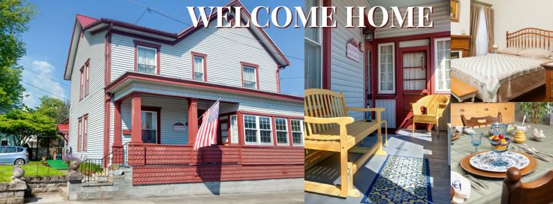
1. Your front photos are always quite zoomed in without a lot of space around the building. What do you have across the street, is there another house blocking the photographer from taking a few more steps back? Or are the surrounding (left and right) buildings ugly and you are cropping out as much as possible out of them?
Looking at the house with the camera, on the right is a quite unattractive physical therapy office that was built as a post office originally so you know it was never pretty.
2. Nice shot, though it would have been totally cool if the sign on the wall would be readable, and there would be no ashtray on the table (is that an ashtray)?
There are tiki candles and that may be the crystal ashtray also
3. Good job!
10. That's a really tall bed! I'm not sure I like the cropping though, the left side cuts the bed at a weird part.
The bed in #3 is actually higher off the floor. This headboard was custom made to replace nightstands - too tight space with the king bed
12. Cool
13. That's a fantastic photo! You can create a collage with another tall photo and make it of a more usable size (tall photos are difficult to use). I love this one! I think in Photoshop you could try aligning the painting with the vertical door line, as it looks a little crooked in the photo.
15. Cropping is much better than #14.
16. The camera should have been positioned a little higher, not at an infant's view height.
20. Wow!
25. I wonder if the photographer used the Lens Correction: Distortion in Lightroom, so as to compensate for the stretching of the corners when using a ultrawide lens.
29. Cropping is much better than #28. Don't be shy showing off your wooden ceiling - it is an asset, not something to crop out of a photo!
This is actually the 1778 2-story log house where we do the ceremony for the elopements. It is not my house. I wanted a great photo of it also


")