word press for dummies

Bed & Breakfast / Short Term Rental Host Forum

Help Support Bed & Breakfast / Short Term Rental Host Forum:

This site may earn a commission from merchant affiliate links, including eBay, Amazon, and others.
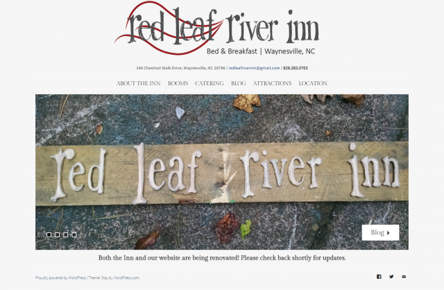
So, my brother in law is less word press challenged than me, so we now have a more or less functioning website. Keeping in mind that we are not open and are currently renovating (we have 1.5 bathrooms done, all the rooms are being worked on) and have zero in the way of furnishings yet, so no room pictures at all, and that we are still working on the website, any feedback that you all can offer? Things we should be looking for as we continue? Things that are horrific and need to be changed right now?
redleafriverinn.com
Thanks!.
Now this I like:
Page load time: 1.41s
Total page size: 1.37MB
Total number of requests: 30
The font (Source Sans Pro) is OK, but you shouldn't use the font-weight 200/300 with this font for small content text.
The weight should be regular (400) with this font, otherwise it is a real PAIN to read even 2 words in this state.
The Rooms Page should probably link each room to their respective pages. When you are done renovating of course you will add some photos there.
I would restructure the header a bit, around your huge logo, something like this (sorry for the large image).
red-leaf.png

 
So, my brother in law is less word press challenged than me, so we now have a more or less functioning website. Keeping in mind that we are not open and are currently renovating (we have 1.5 bathrooms done, all the rooms are being worked on) and have zero in the way of furnishings yet, so no room pictures at all, and that we are still working on the website, any feedback that you all can offer? Things we should be looking for as we continue? Things that are horrific and need to be changed right now?
redleafriverinn.com
Thanks!.
Sachi well done!
I will say the font is too small and too light. That is the only thing from a visitor perspective that jumps out.
With your culinary skills, you can have some fun BEFORE hand making some goodies and photographing (which is the other half of the battle) and sharing big and bold on your site! Building that anticipation.
Smiling innkeepers - ahhhhhh what a wonderful thing.
Good job blogging. Love the midget with the powerwasher
shades_smile.gif

Edited to add: I just looked through some reno pix and more on the blog, may I make a STRONG suggestion - as I have been apt to say in just about every scenario lately: USE THE FORCE LUKE!
So for that, on every single blog article, yes I see it is on your website, but every single blog article add:
  1. Your B&B Name
  2. Your B&B Location
  3. Your website URL
This is REALLY important for your SEO and building your site content for Google. Even if you have a standard tag line at the end of every blog post like you have but with the link, the location, and the name:
"For all the latest up-to-date news and pictures, be sure to like us on Facebook. Just search for Red Leaf River Inn!" Don't have this, enter the LINK on your blog, don't ask anyone to search. FB is going to a midlife crisis, so don't count on it as all your eggs in one basket, definitely use the force on your location, name and website URL.
Then, if you have share buttons (which are an easy widget to add) so you can simply click and share on all social media platforms. :)
The font is still an issue, it is very difficult to read. So we won't read. I hope that makes sense.
 
So, my brother in law is less word press challenged than me, so we now have a more or less functioning website. Keeping in mind that we are not open and are currently renovating (we have 1.5 bathrooms done, all the rooms are being worked on) and have zero in the way of furnishings yet, so no room pictures at all, and that we are still working on the website, any feedback that you all can offer? Things we should be looking for as we continue? Things that are horrific and need to be changed right now?
redleafriverinn.com
Thanks!.
I love your town! Almost started a b & b there many many years ago.!
Get rid of this : Proudly powered by WordPress | Theme: Stay by WordPress.com. Don't know if it is in a footer setting or in the footer.php. Put your own credit / copyright line there.
I don't care for those link boxes on your slider. They really aren't needed because they are in your nav bar. I think they take away from the photos. Try using a better font. This one in grey is hard to read. I'd like to see a bit more color to make pages pop. Can you do a full width slider instead?
For your attractions page. Don't put the url on the page,(amateur) the link should actually be the name of the attraction with the link embeded into it. To do do: Highlight the name, click the LINK icon on the formatting tool bar and put in the url in the link box. CHeck Open Link in a new window.
.
FWIW, sachi, I actually liked the link boxes on the slider images, and appreciated that each was appropriate to the image. I don't think it matters that you have the same links in your menu bar, people look at the images first, and those link boxes serve as a sort of caption that (to me anyway) work well to tie to images to the content of your site.
 
So, my brother in law is less word press challenged than me, so we now have a more or less functioning website. Keeping in mind that we are not open and are currently renovating (we have 1.5 bathrooms done, all the rooms are being worked on) and have zero in the way of furnishings yet, so no room pictures at all, and that we are still working on the website, any feedback that you all can offer? Things we should be looking for as we continue? Things that are horrific and need to be changed right now?
redleafriverinn.com
Thanks!.
Sachi well done!
I will say the font is too small and too light. That is the only thing from a visitor perspective that jumps out.
With your culinary skills, you can have some fun BEFORE hand making some goodies and photographing (which is the other half of the battle) and sharing big and bold on your site! Building that anticipation.
Smiling innkeepers - ahhhhhh what a wonderful thing.
Good job blogging. Love the midget with the powerwasher
shades_smile.gif

Edited to add: I just looked through some reno pix and more on the blog, may I make a STRONG suggestion - as I have been apt to say in just about every scenario lately: USE THE FORCE LUKE!
So for that, on every single blog article, yes I see it is on your website, but every single blog article add:
  1. Your B&B Name
  2. Your B&B Location
  3. Your website URL
This is REALLY important for your SEO and building your site content for Google. Even if you have a standard tag line at the end of every blog post like you have but with the link, the location, and the name:
"For all the latest up-to-date news and pictures, be sure to like us on Facebook. Just search for Red Leaf River Inn!" Don't have this, enter the LINK on your blog, don't ask anyone to search. FB is going to a midlife crisis, so don't count on it as all your eggs in one basket, definitely use the force on your location, name and website URL.
Then, if you have share buttons (which are an easy widget to add) so you can simply click and share on all social media platforms. :)
The font is still an issue, it is very difficult to read. So we won't read. I hope that makes sense.
.
Joey Bloggs said:
Smiling innkeepers - ahhhhhh what a wonderful thing..
Yes I liked that to. Important to show you're real people who guests will enjoy meeting.
 
So, my brother in law is less word press challenged than me, so we now have a more or less functioning website. Keeping in mind that we are not open and are currently renovating (we have 1.5 bathrooms done, all the rooms are being worked on) and have zero in the way of furnishings yet, so no room pictures at all, and that we are still working on the website, any feedback that you all can offer? Things we should be looking for as we continue? Things that are horrific and need to be changed right now?
redleafriverinn.com
Thanks!.
I love your town! Almost started a b & b there many many years ago.!
Get rid of this : Proudly powered by WordPress | Theme: Stay by WordPress.com. Don't know if it is in a footer setting or in the footer.php. Put your own credit / copyright line there.
I don't care for those link boxes on your slider. They really aren't needed because they are in your nav bar. I think they take away from the photos. Try using a better font. This one in grey is hard to read. I'd like to see a bit more color to make pages pop. Can you do a full width slider instead?
For your attractions page. Don't put the url on the page,(amateur) the link should actually be the name of the attraction with the link embeded into it. To do do: Highlight the name, click the LINK icon on the formatting tool bar and put in the url in the link box. CHeck Open Link in a new window.
.
Thanks, we love this town. I will pass your comments on to my brother in law. I know when I look at the site on my phone, the link boxes on the slider help because the nav bar disappears and becomes a little box at the top corner of my screen. I don't know if that is fixable or if that is just because it is on a smaller screen.
 
So, my brother in law is less word press challenged than me, so we now have a more or less functioning website. Keeping in mind that we are not open and are currently renovating (we have 1.5 bathrooms done, all the rooms are being worked on) and have zero in the way of furnishings yet, so no room pictures at all, and that we are still working on the website, any feedback that you all can offer? Things we should be looking for as we continue? Things that are horrific and need to be changed right now?
redleafriverinn.com
Thanks!.
sachi3679 said:
Keeping in mind that we are not open and are currently renovating...
I'm pretty sure once you have a website, most of the work is done ;-)
What beautiful photos you have for the homepage slider!!!! After seeing that, I really DO think most of the work is done! I'd love to stay there!
.
Ah, yes, now all we have to do is sit back and relax, right? =) The property is gorgeous, but every time I think we might be getting somewhere, we find 15 more projects to do. The joy of renovation.
 
So, my brother in law is less word press challenged than me, so we now have a more or less functioning website. Keeping in mind that we are not open and are currently renovating (we have 1.5 bathrooms done, all the rooms are being worked on) and have zero in the way of furnishings yet, so no room pictures at all, and that we are still working on the website, any feedback that you all can offer? Things we should be looking for as we continue? Things that are horrific and need to be changed right now?
redleafriverinn.com
Thanks!.
Sachi well done!
I will say the font is too small and too light. That is the only thing from a visitor perspective that jumps out.
With your culinary skills, you can have some fun BEFORE hand making some goodies and photographing (which is the other half of the battle) and sharing big and bold on your site! Building that anticipation.
Smiling innkeepers - ahhhhhh what a wonderful thing.
Good job blogging. Love the midget with the powerwasher
shades_smile.gif

Edited to add: I just looked through some reno pix and more on the blog, may I make a STRONG suggestion - as I have been apt to say in just about every scenario lately: USE THE FORCE LUKE!
So for that, on every single blog article, yes I see it is on your website, but every single blog article add:
  1. Your B&B Name
  2. Your B&B Location
  3. Your website URL
This is REALLY important for your SEO and building your site content for Google. Even if you have a standard tag line at the end of every blog post like you have but with the link, the location, and the name:
"For all the latest up-to-date news and pictures, be sure to like us on Facebook. Just search for Red Leaf River Inn!" Don't have this, enter the LINK on your blog, don't ask anyone to search. FB is going to a midlife crisis, so don't count on it as all your eggs in one basket, definitely use the force on your location, name and website URL.
Then, if you have share buttons (which are an easy widget to add) so you can simply click and share on all social media platforms. :)
The font is still an issue, it is very difficult to read. So we won't read. I hope that makes sense.
.
Thanks, but I do the blog, my brother in law did the web site. I can claim no credit =) I will ask him about fixing the font. I did the blog on blogger and there it has all the little share buttons, but I guess that didn't carry over. I will add something to each post.
Speaking of SEO and the great google - does anyone know why we might have fallen off google maps? I set up our account several months ago and we were #11 in the list if you searched b&b's in our town, but now we have disappeared, although we still show up if you search for us specifically. Of course, the old (closed) b&b at our location shows up on the list.
 
So, my brother in law is less word press challenged than me, so we now have a more or less functioning website. Keeping in mind that we are not open and are currently renovating (we have 1.5 bathrooms done, all the rooms are being worked on) and have zero in the way of furnishings yet, so no room pictures at all, and that we are still working on the website, any feedback that you all can offer? Things we should be looking for as we continue? Things that are horrific and need to be changed right now?
redleafriverinn.com
Thanks!.
I love your town! Almost started a b & b there many many years ago.!
Get rid of this : Proudly powered by WordPress | Theme: Stay by WordPress.com. Don't know if it is in a footer setting or in the footer.php. Put your own credit / copyright line there.
I don't care for those link boxes on your slider. They really aren't needed because they are in your nav bar. I think they take away from the photos. Try using a better font. This one in grey is hard to read. I'd like to see a bit more color to make pages pop. Can you do a full width slider instead?
For your attractions page. Don't put the url on the page,(amateur) the link should actually be the name of the attraction with the link embeded into it. To do do: Highlight the name, click the LINK icon on the formatting tool bar and put in the url in the link box. CHeck Open Link in a new window.
.
Thanks, we love this town. I will pass your comments on to my brother in law. I know when I look at the site on my phone, the link boxes on the slider help because the nav bar disappears and becomes a little box at the top corner of my screen. I don't know if that is fixable or if that is just because it is on a smaller screen.
.
That is "standard" for responsive themes. Always condenses the nav bar. No matter what theme you use.
 
Back
Top